When is Premium Riskier Than Loss Slides
presentations
insurance
pricing
PIRC presentation comparing volatility from premium and loss uncertainty.
When is Premium Riskier Than Loss?
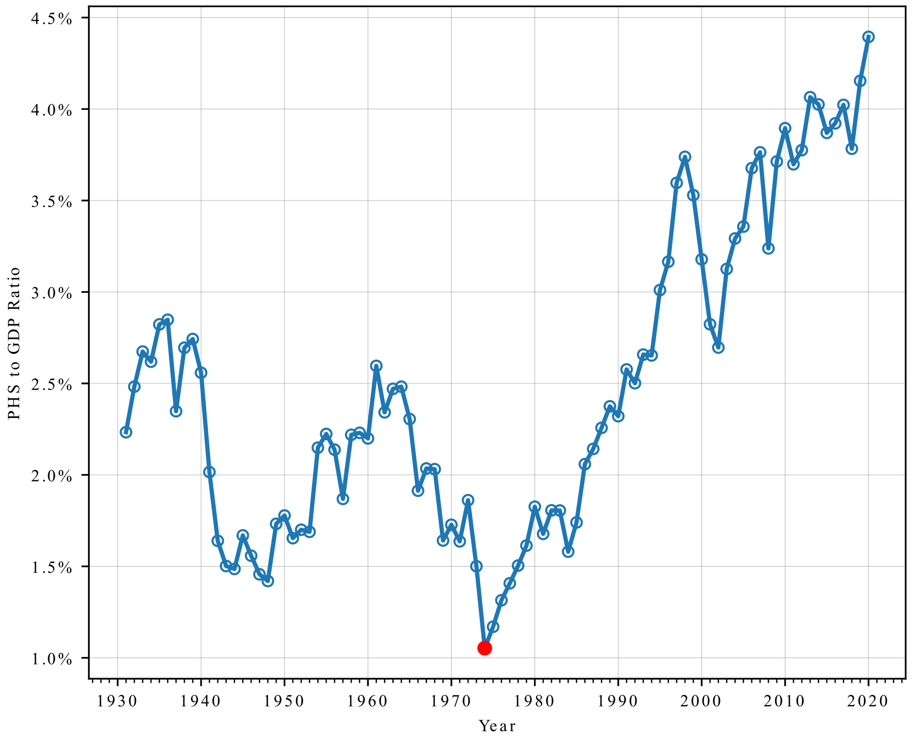
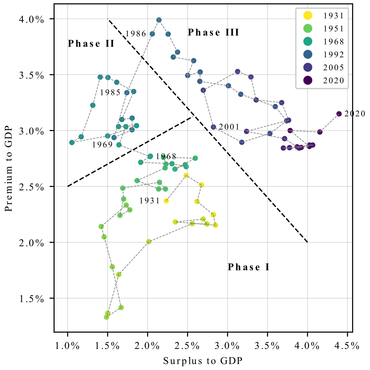
Premium to GDP Ratio: 1968 Watershed
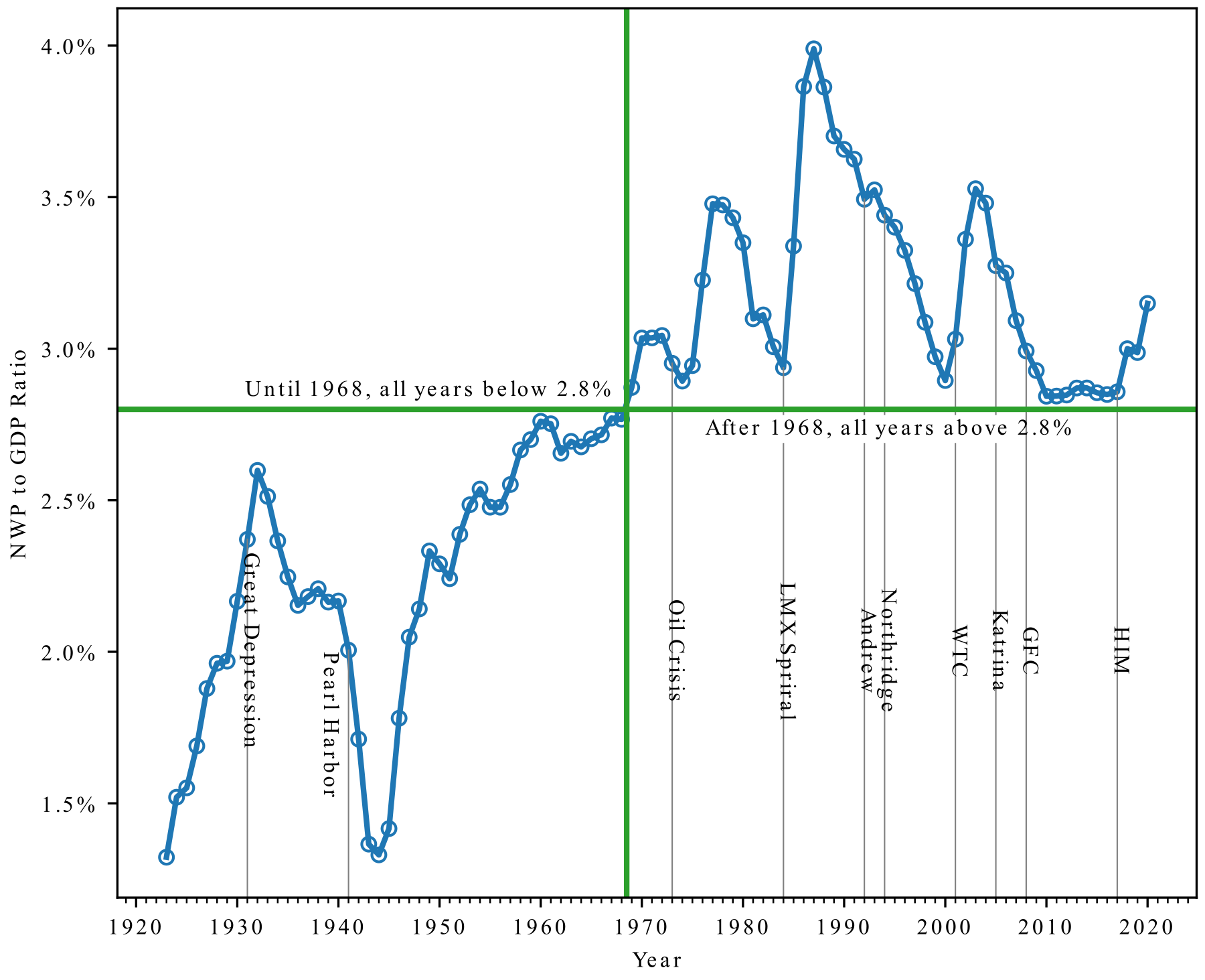
Premium to GDP Ratio
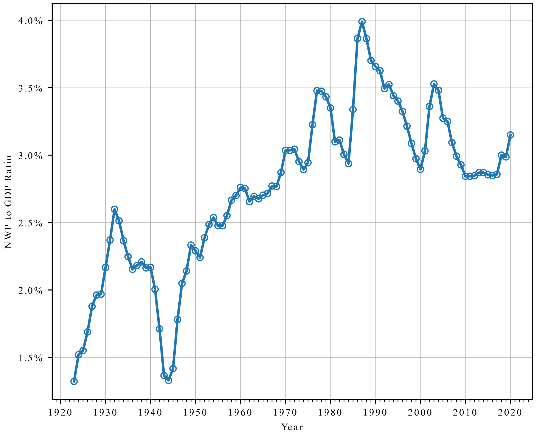
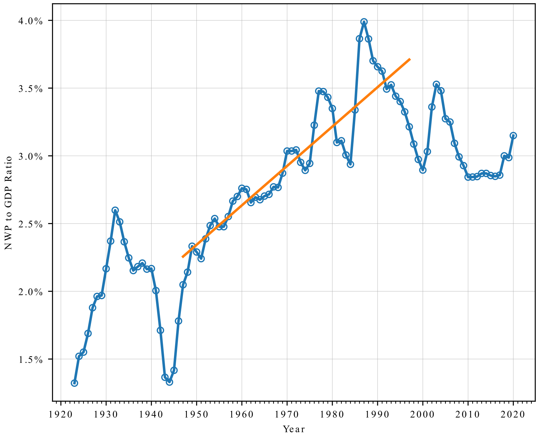
Premium to GDP Ratio: Cyclical Growth Between 1947 and 1997
The Underwriting Cycle Is Driven by Commercial Lines
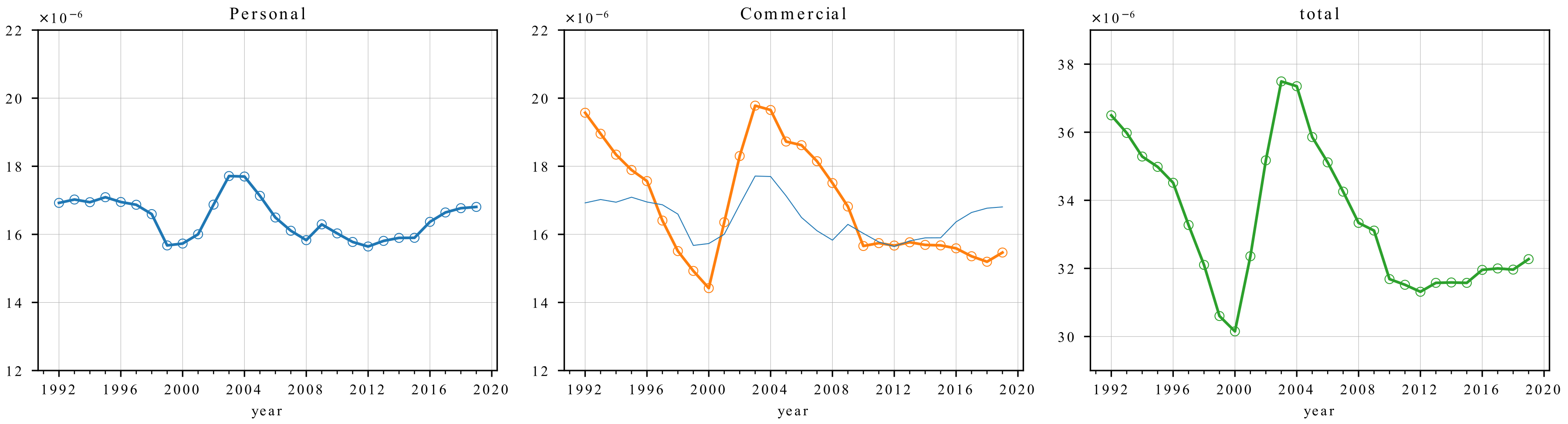
Calm Surface Masks Inner Turmoil
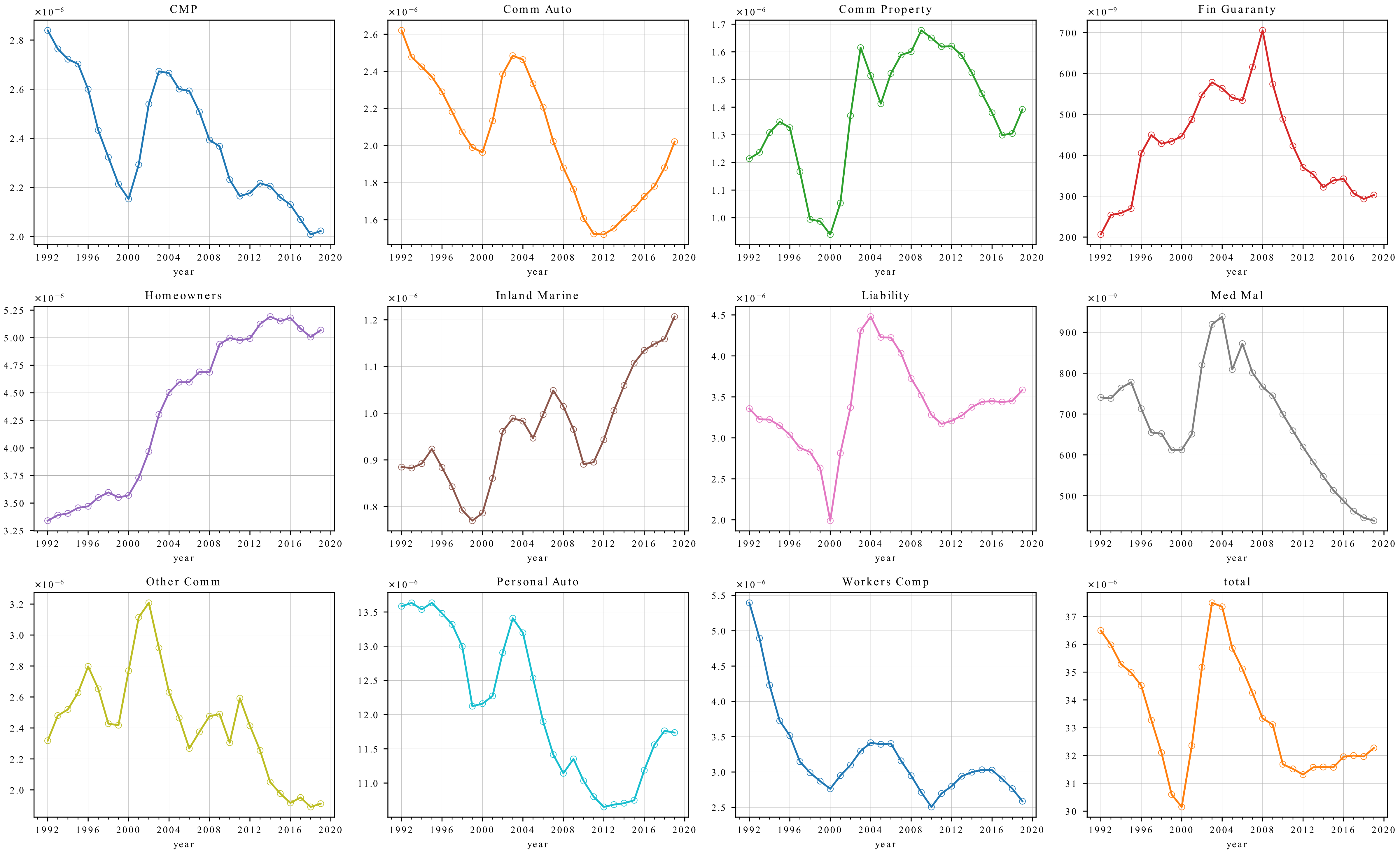
Premium and GDP Growth Since 1992 (1992=1.0)
Surplus to GDP Ratio, 1931-2020e
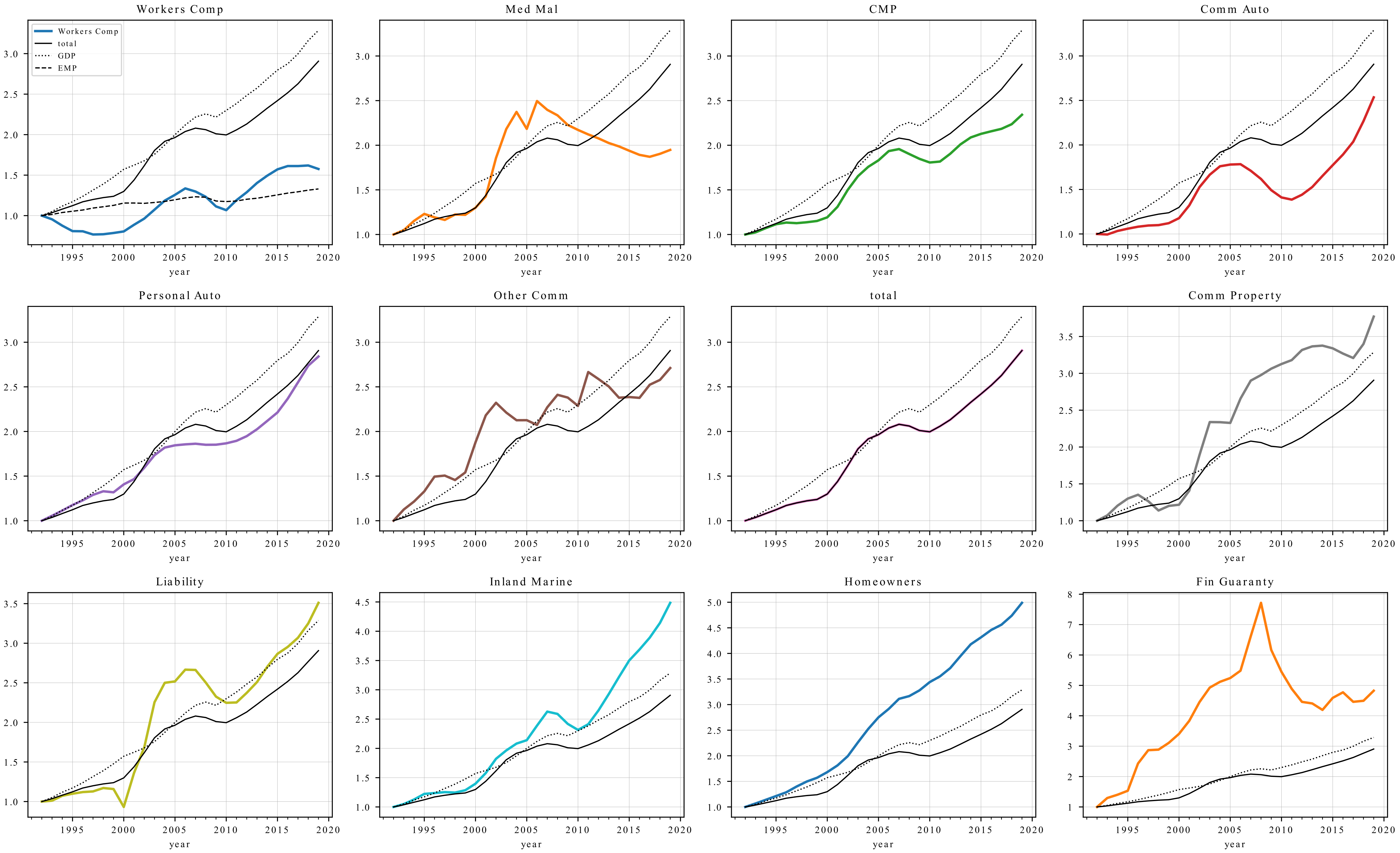
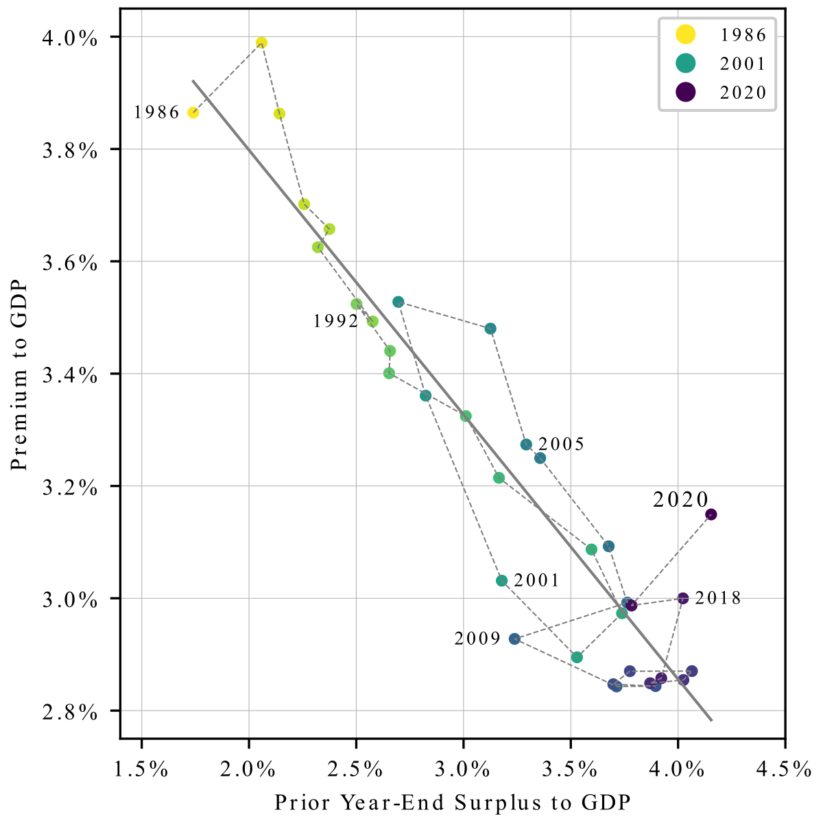
Market Dynamics Since 1986 Explained by Prior Year Surplus Levels
:::::: :::
::: :::
::: ::::::
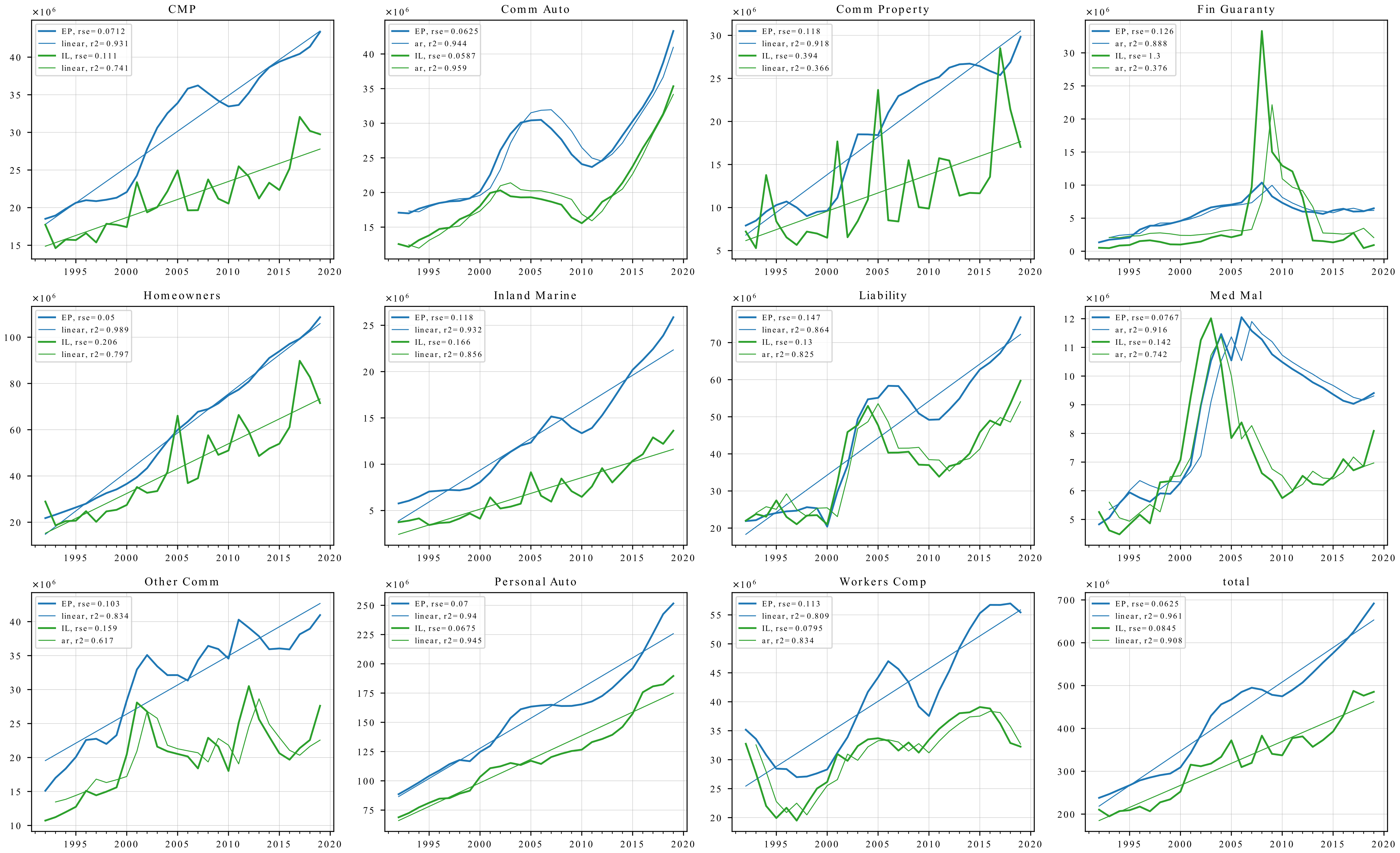
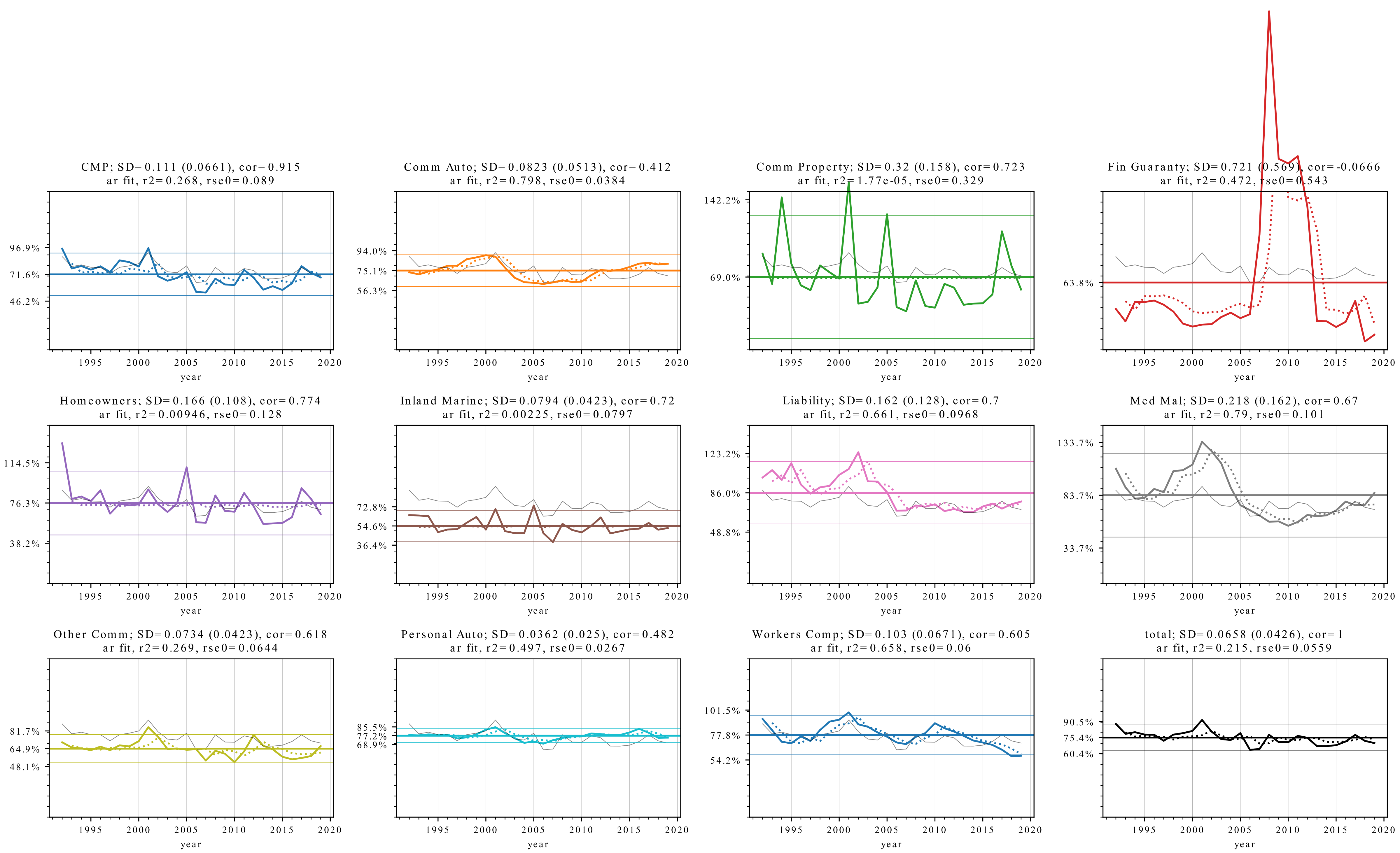
Direct Loss Ratio Time Series by Major Line
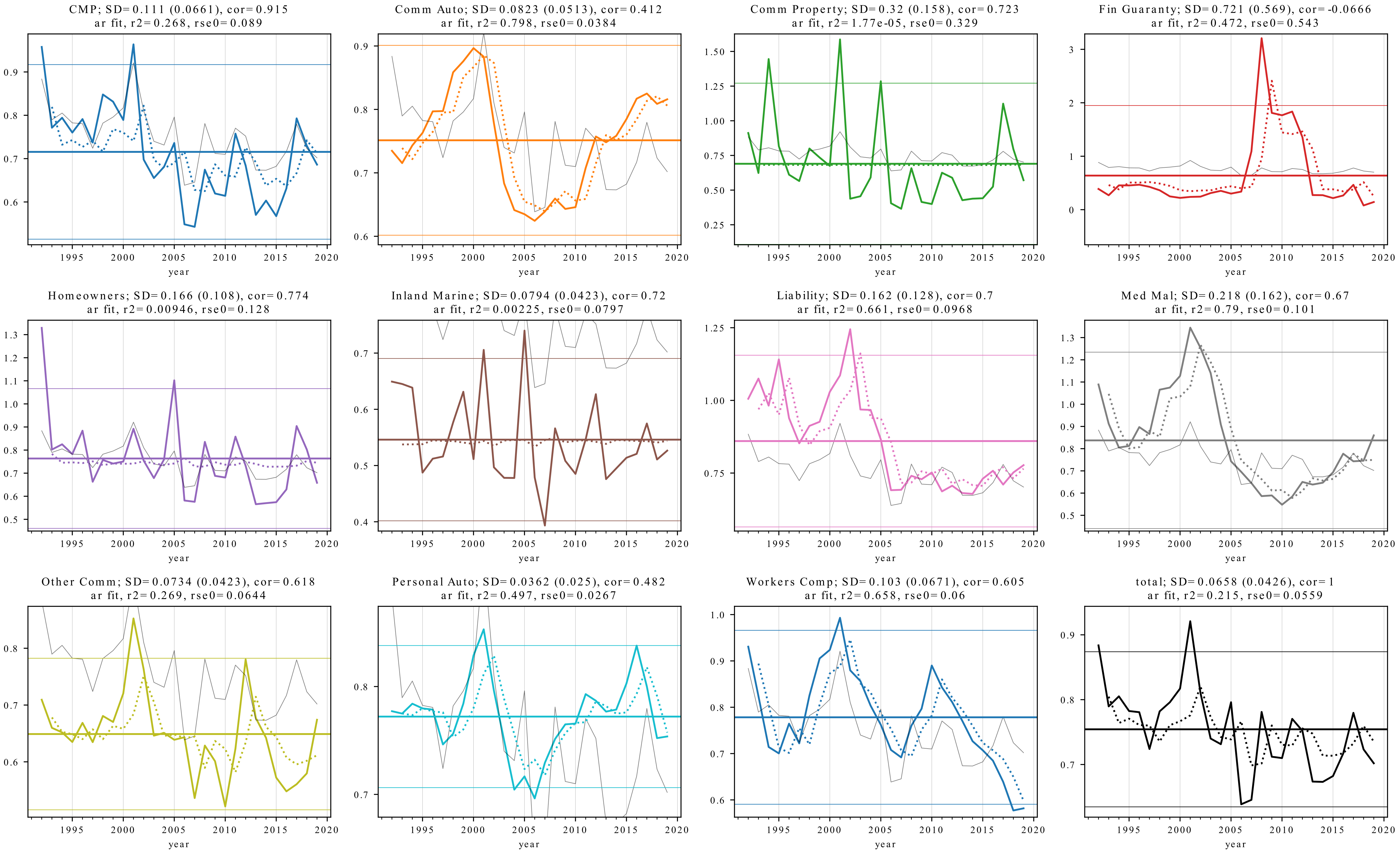
Loss Ratio Time Series by Major Line
Title decoder: CMP; SD=0.111 (0.0661), cor=0.915 ar fit, r2=0.268, rse0=0.089
- Line; standard deviation
- Down-side semi-deviation is shown in parenthsis (explain)
- Correlation of the line with total on the first line
- (second line) shows the \(R^2\) and residual standard error of an autoregressive loss ratio model
Interpretation
- When the
rseis much lower thanSDit suggests the market cycle is predictable - Tends to occur in casualty lines (e.g., commercial auto, medical malpractice, private passenger auto, and workers compensation)
- The cycle for property lines tends to be idiosyncratic, for obvious reasons.
Line Legend
- Thin gray line in each plot shows the
totalloss ratio, for context - The horizontal lines show the mean (thicker) and mean \(\pm \Phi^{-1}(22/23)= \pm1.71\) standard deviations
- If the loss ratios were normally distributed we expect all observations from 22 years (1996-2017) to fall within these tram lines
- They provide a surprisingly good estimate of the range of loss ratio, except for
Financial Lines(which uses a different tick spacing, note).
Direct Loss Ratio Time Series by Major Line, Loss Ratio Scale 0 to 150 Percent
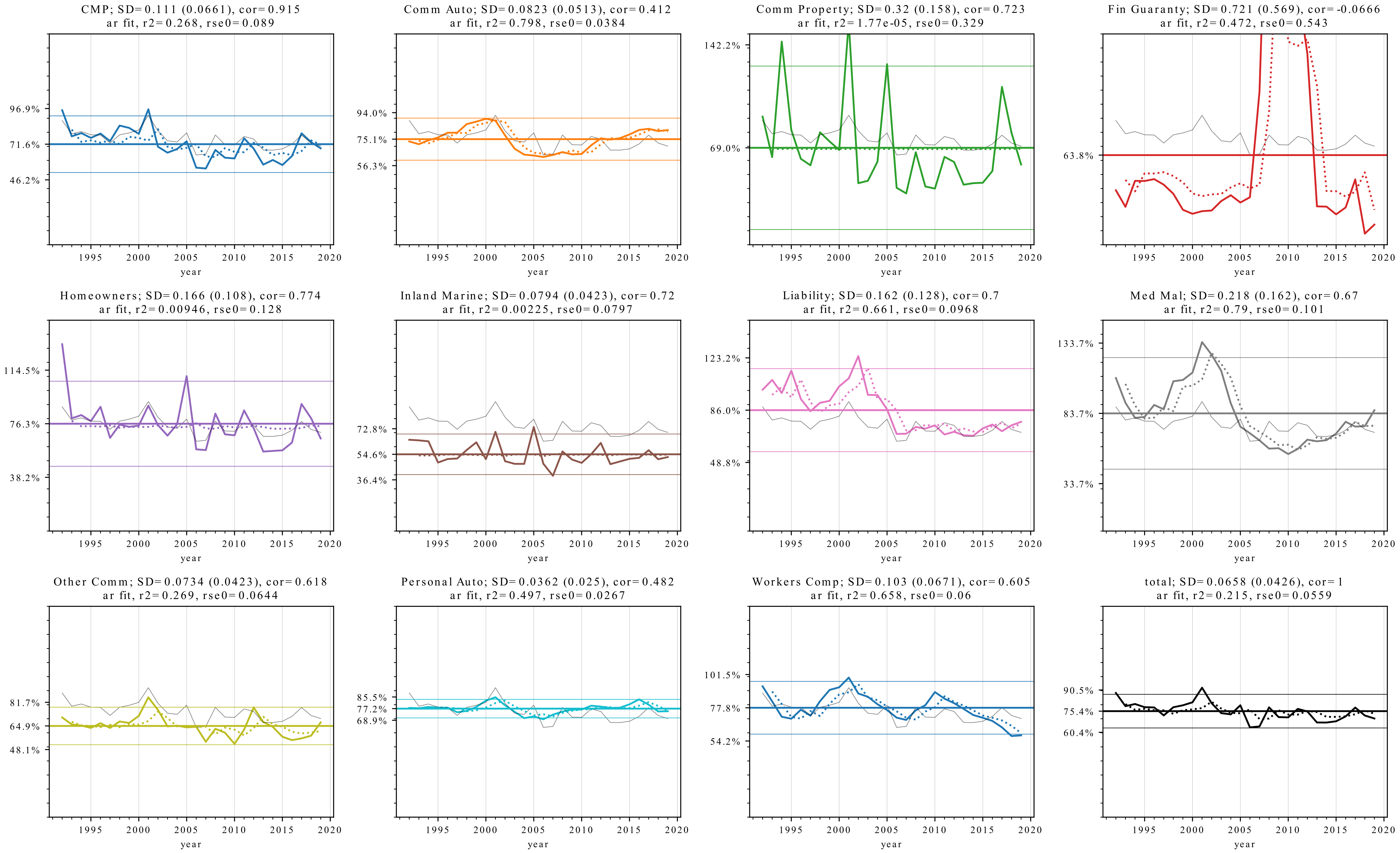
Some Lines Are More Volatile Than Others…
Direct Premium and Loss Dynamics